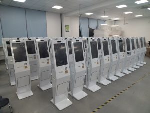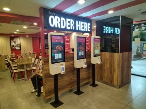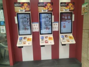
Restaurant menus now appear in several forms. Guests may receive a printed menu, scan a QR code to browse on a phone, or order directly from a kiosk or dual-screen point-of-sale terminal. Once the menu moves onto a large display, it becomes more than a list of dishes and prices. It must guide attention, explain choices and support an accurate final review before payment.

A large screen self ordering kiosk provides more room for images and product information, but more space does not justify more clutter. The screen should help guests understand categories, compare options and confirm prices without pressure. Aggressive tactics that hide lower-priced items or make an upsell difficult to decline may produce a short-term gain, but they can also weaken trust in the restaurant.
Use visual hierarchy to make the menu understandable
Position, image size and color determine what a guest notices first. Restaurants often place signature or higher-priced dishes in prominent locations. A premium item can act as a price reference, making mid-range dishes feel more accessible by comparison. The same principle is used in printed menus, but a digital interface can apply it more consistently across categories.
This approach should not compromise price transparency. Every item needs a clear name, price and size or option where relevant. A large screen self ordering kiosk can highlight selected dishes while still giving equal access to the complete menu. Promotion pages may be visually rich, but the basket and confirmation page should favor clarity over decoration.
Choose images colors and type for a specific purpose
Warm colors such as red, yellow and orange are often associated with heat and appetite, which is why they appear frequently in food presentation. Large images also attract attention, especially when a guest is standing several feet from the screen. The best image is not necessarily the largest one; it is the image that helps the guest understand what will be served.
Wording and typeface contribute to the impression of a dish. Accurate terms that describe texture or preparation, such as roasted, crisp or slow-cooked, give the reader useful information. Rounded type can feel softer, while angular letterforms can feel heavier or more substantial. These associations are secondary, however. Readable type, sufficient contrast and consistent button labels are more important than a decorative style.

Use the screen for content that paper cannot provide
A large screen self ordering kiosk can show several views of a dish, a short preparation video or a simple sequence explaining how a meal is assembled. This gives guests more context before they order and lets the restaurant update sold-out items, combinations and time-based menus without printing replacements.
Dynamic content needs limits. A long autoplay video can slow the ordering process, cover controls or distract the next person in line. Media files should load quickly, and the interface should always provide a direct route back to ordering. Images and video should match the food that the restaurant actually serves. A polished visual that creates the wrong expectation will make the experience worse, not better.
Design for distance touch and final confirmation
People approach the machine from different angles and operate it at different heights. Text size, spacing, contrast and touch-target dimensions should reflect the viewing distance and physical installation. Long dish names can be shortened in the category view, with supporting details placed on a product page instead of compressed into one crowded card.
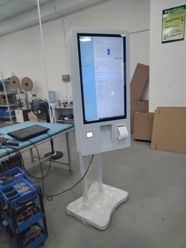
The large screen self ordering kiosk should also make corrections easy. Guests need obvious controls for changing quantity, removing an item and returning to a previous category. Before payment, the interface should display the complete order, selected options and total amount in one clear view. This final review protects both the guest and the restaurant from avoidable order disputes.
Personalize only when the guest understands the choice
When connected to a membership system, a kiosk may present relevant items based on preferences or previous orders after the guest chooses to sign in. Personalization can reduce repeated searching, but the restaurant should explain how the information is used and provide a way to continue without personalized suggestions. Recognition should not become a condition for placing a basic order.
A large screen self ordering kiosk works best when menu design supports informed choice. Visual emphasis, descriptive language, video and recommendations can make the menu easier to explore, but they should remain accurate and easy to dismiss. The practical goal is a guest who can find a suitable meal, understand the price and confirm the order with confidence.
Keep the content useful after launch
Menu design is not finished when the kiosk goes live. Restaurant teams should review where guests hesitate, which screens generate repeated corrections and whether promoted items remain available. Content changes should be tested before peak hours, and older images or offers should be removed when they no longer match the menu.
With routine review, the display can present richer information than paper without making the decision harder. The most effective interface uses the extra screen area to improve understanding, not to fill every available space.
Explore related configurations in the self-service kiosk product range.